
I feel like testing : http://wefeelfine.org/index.html, an exploration of human emotion on the web.

I feel like testing : http://wefeelfine.org/index.html, an exploration of human emotion on the web.

I am always talking about what a good job some agencies are doing integrating apps/advertising/entertainment and true interactivity with the consumer. This is another one of those examples. Lean Mean Fighting Machine created this site for the Samsung Pixon which is a phone with an 8 megapixel camera. The site follows professional photographer Nick Turpin throughout Europe while he takes pictures and lets users decide what the next subject should be by clicking on the last image. Users and the photographer can communicate via twitter and you can also see where his current location is. Pretty sweet.
http://www.thephotographicadventuresofnickturpin.com/

Here is another great site. This site takes the photo upload to another level by adding it to a flash video, with perspective.
The site is for one of those pills that you take to prevent hang overs.
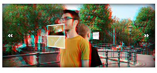
I found this site on the FWA the other night while I was home. It asked me weather I had 3D glasses or not. Unfortunately I didn't have 3d glasses readily available at home, but I do have some in the office. Don't worry about nuances such as: "why do I have 3d glasses at the office?". I thought the site was cool without the glasses since they used PaperVision 3D and we are in the process of designing a site with PaperVision 3D as well. So I was curious to find out if the site really worked with the 3D glasses and it does!
The site is for an interactive shop in Amsterdam, you can check out their blog here as well.
 Another great example of a brand using entertainment to keep you engaged in order to create brand awareness. Now go, shave your own Fiffi.

This is a beautiful site I found this morning. Really nice illustration and the scroll bars are very original. I also feel that the clothing style is captured nicely by the design of the site, which at the end is what good web design should accomplish every time.

We all love crazy, but is it good for an ad agency to be crazy? I think these people are crazy.....but amazingly enough, I would probably hire them....Crazy, I know.
http://www.runningwithscissors.co.nz/
(Source)

I know that this is old news, but since this is a new blog.....
For me, this is the site of the last year. Modernista, advertising agency out of Boston with clients such as Hummer, Cadillac, MTV, Napster, Gap and others, used web 2.0 to an extreme. Their entire site is an iframe of popular web 2.0 sites such as wikipedia and myspace as their "About Us" section; youtube for their Video portfolio; google news for their, well, news.and flickr for the print portfolio; just to name a few. Genius! Hats off to them.
http://modernista.com

Here is another example of alternative navigation, such as the one in Sour Molly. Not sure what this site is all about, but it goes back to using the web more as entertainment than information. It kept me on until I was through with the entire journey and sometimes thats the outcome that the project calls for.
http://www.ulechang.com/

This is one of the nicest sites I have run across in a long time. This is a site for Yogurt! Yogurt! The site was done by Kinetic, an agency in Singapore. I feel that Europe and Asia are pretty far ahead of us when it comes to design and interaction. Either that or their clients just have more of an open mind. Maybe its just me.


